Touching Windows 8 – A Tale of Two Tablets

What better day to begin the story of Windows 8 than October 26, the “official release.” Freshly equipped with an “almost tablet” – a Sony VAIO Ultrabook T13124 from Staples, we can put Windows 8 to work. Perhaps not just yet to real work, since I am composing this post on my desktop and well-worn Microsoft keyboard.

Note: All puns are intended.

These posts will explore the touching experience of Windows 8, and compare it especially to Apple’s iPad and iOS. I choose not to pursue Windows RT tablets at this point. After well more than a year now of iPad use, my hope for Windows 8 is that it will provide the kind of touch interface that has made consuming content so effective on the iPad, while providing access to full strength writing editing and file management using Windows tools. While the iOS has been exciting for its implementation of touch and the clarity and focus of the software on it, the difficulties with working with the file system, as well as the difficulty retaining full fidelity to documents created and edited in Microsoft office, has inhibited any recommendation to use an iPad as a replacement for a laptop.

Setup; Turning On

A most attractive part of the iPad experience is that it is ready to do something the moment one turns it on. That is true in day-to-day use, and it is most true when one first buys the device. Yes, it was necessary to input the password for our home WIFI network. Apps needed to be purchased, but that could come as needed, and did not delay touching the screen to do something.

The new laptop has been churning away for somewhere around 30 minutes setting itself up, the last 10 minutes devoted to the installation of Office 2010 .  We are still in Microsoft country, where a message to reboot to complete setup was hiding behind a dialog indicating that Office 2010 was completing setup. I did want a PC, not an iPad, didn’t I.

In 15 months of use of iPads I have restarted them perhaps 10 times to clear stuck programs. I don’t want to even try to estimate the number of restarts my Windows based PC’s have experienced – though far too many of them resulted from a bad SSD drive on my desktop.

Hidden from sight

If you have been persuaded to connect your new computer and settings through the cloud, your Microsoft Account password stands in the way of starting the computer. I am all for security, and rigorous passwords. The program and app 1Password govern my life on PC, iphone and iPad. Yet the startup screen hides the login, requiring a swipe up before it appears.

The Start  menu  hides, too. Sorry, I meant the All Apps button, available anywhere, with a swipe up from the bottom. I did not mean to confuse that with the Start Tiles.

Deep in the Design

I feel urgent to learn the rules, understand and absorb the design that drives these two experiences of touching a computer screen.

Each of the software giants has documented and published, not very loudly, their touch interface design principles.

For Apple, look to the iOS Developer library and its Human Interface Principles. http://developer.apple.com/library/ios/#DOCUMENTATION/UserExperience/Conceptual/MobileHIG/Principles/Principles.html#//apple_ref/doc/uid/TP40006556-CH5-SW1

For Microsoft, look at the Windows Dev Center and the Windows User Experience Design Principles. http://msdn.microsoft.com/en-us/library/windows/desktop/dd834141.aspx

These deserve very careful study, since they expose very significant differences in the principles guiding iOS and Windows. To compete with 100 million iPads, Windows needs to be at least very good, if not superlative, in user experience. Next time, we will dig in.


Before
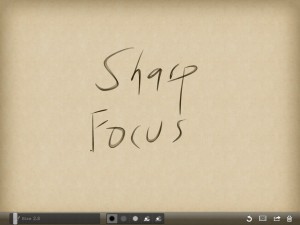
Defeat Distraction – Restore Focus

Too many stimuli – too many interruptions – too little focus – too little thought?

For those of us who find neatness and organization an ever present challenge, our screens – whether computer, phone or tablet, may offer no refuge. Littered with icons, busied with backgrounds, riddled with ribbons – the typical Windows landscape.

My inspiration for this essay comes from an iPad / iPhone App called Zen Brush. Written by folks in Japan who live near the center of the 2011 earthquake, it presents a drawing surface elegant in its simplicity and execution. It presents so few controls, yet render strokes with a delightful.

Zen Brush Screen from iPad

As a tool for a purely visual activity, the wordless experience when drawing with Zen Brush works well. Just two brush shades, brush size, erase and a packaged set of themes are all the tools presented. For $2.99, try it and enjoy.

The iPad experience and the pleasure of Zen Brush inspired me to take a fresh look at Windows techniques that  minimize visual clutter, and help focus thought and work on the task at hand. Before trying these, try to sense how you interact with a computer. These suggestions may work better if the name of a program triggers thought more easily than an icon. If you can click on an icon without thinking at all about the name of the program, more visual cues may help. My strategy uses both – starting with names, then using fewer visual cues in their appropriate context. These suggestions assume a Windows 7 environment, without the touch screen enhancements coming in Windows 8.

First Step – Clear the Icons
Clear the icons off your desktop. As an experiment in near zero clutter, trying clearing everything but the Recycle Bin. (It resists removal anyway.) Mousing to an icon, especially when there are many of them, is slow and a demanding hand / eye coordination activity. The visual benefits of icons are reduced when they rearrange or move.

To launch programs, use a combination of the task bar for just a few of the most frequently used programs and Windows Search for less frequently used programs. I prefer Windows search to the Start Menu. It is fast, and it triggers the brain’s association with the name or a program, without having to mouse through a menu.

Second Step – A Peaceful Desktop

Simplify the desktop, using an image or theme with minimal distraction. While it is most tempting to populate the desk with the delicious smile of offspring, that will also reduce  focus on work. Enjoy those photos in their appropriate time. For your desktop, choose a photo or artwork with low detail or just a soothing color or gradient.

Third Step – Hide the Ribbons

The ribbon interface – officially in Microsoft Speak the Fluent User Interface – can be hidden. I prefer to toggle it with CTRL F1, but there is also the caret icon in the upper right corner of the ribbon. When needed for a task, the detailed collection of tools presented by a ribbon can be very helpful. When not needed, hiding the clutter of icons  lowers stress and distraction .

Fourth Step – Magic Keys

With Windows 7 we have a tool for managing the cluttered pile of too many open windows . The combination of Windows (Start) key (between CTRL and  ALT ) plus D toggles the open windows with a clean  desktop – instantly.  Though the Show Desktop region to the right of the time in the task bar does the same thing,  keystrokes remove the need for mouse precision. The Windows key plus TAB cycles open windows in a dramatic visual that also presents an uncluttered and focused way to view and choose a window. Together, showing the desktop, then Windows TAB to a desired window offers a clear clean focused way to navigate.

Let me know whether you find this strategy helpful.

A Summer’s Speeches and Writing

With fall’s colors sprinkled among our forests, it’s a good time to share a summer’s worth of webinars and presentations. Follow the links to view the programs and articles.

July  brought Technology Guided Drafting and Review,  a webinar devoted to the tools that help lawyers drafting transactional documents maintain the accuracy and completeness of complex negotiated documents in practices pressed for time and fees.  The webinar illustrated and expanded on the discussion in the white paper Technology Guided Drafting from Opportunity to Imperative. Both webinar and white paper feature the new product from Microsystems, Eagle EYE, The Agreement Checker. It has been a great pleasure to work with the team at Microsystems to learn about this product and to  help to explain it to lawyers and their staff. Precise drafting requires careful and exact use of language throughout each agreement and often among many agreements. Speaking to my colleagues and friends who continue to bear responsibility for this work, the kind of computer guided help that assists drafting by our friends in architecture and engineering. These presentations develop the theme that with a program such as EagleEYE, lawyers drafting agreements can be assisted and protected by similar technology guidance.

August. Leading up to the ILTA Conference at the end of August, I had the pleasure of working with Glynn Fluitt and Kenneth Henry of Cravath, Swaine and Moore as well as David Neesen at Greenberg Glusker and  Toby Adamson at Microsystems. One of the best parts of preparing workshops for the ILTA Conference is the chance to develop and present ideas together. Our workshops, Metadata – Deal with It! and The iPad as Laptop Replacement? gave us a chance to challenge listeners with refreshed perspectives on familiar and not so familiar technology of metadata and the opportunities and risks associates with the surging interest and use of iPads.

September  brought another webinar, You Let What Go Out? – Protecting Today’s Transactional Lawyer. Presented by American Lawyer Media with Lynn Frances of e-Discovery Writer and Bonnie Reid of Microsystems, the webinar looked at trends in practice and the risks and opportunities associated with technology guided drafting, mobile and tablet based computing and metadata management.

In the mail in the last week of September, the Probate and Property publication of the American Bar Association’s Real Property, Trust and Estate Law Section featured iPads and iPhones: Tools for PracticeThis article offers insights into the experience and use of the iPad and iPhone as practice tools for lawyers, with special emphasis on the work of property and probate lawyers. It explores the potential for Evernote as a tool for field work and due diligence, highlighting the use of geotagging.


(Re)Enabling – Technology Strategies for Law Today

Reopening a conversation

A blog can | should liberate one’s mind and fingers to express thoughts that matter, to share ideas tested and untested. I hope to reopen in this blog the online and in person conversations that began some years ago when Woody’s Office Watch published my columns called “The Word of Law.”

This renewed conversation began this year with webinars and presentations at ILTA (the International Legal Technology Association.

Enabling

My interest and commitment to technology has always been to help lawyers and those who support them. Technology must serve the practice of law. Perhaps (not so perhaps?),  technology seems to govern, to demand, to overwhelm. We technology evangelists must remember to remind ourselves of our responsibility to serve.

Here “enabling ” should be read as a strong positive – techniques, tools, strategies that support the practice of law instead of overgrowing, even crowding it out.

Why  rethis and rethat?

It seems to be the right time, personally, professionally and in the industry for fresh thought about technology and the practice of law. As a profession and industry (and personally), we have pursued technology’s application to the practice for a human generation. What the equivalence in technology generations might be is harder to measure. Moore’s Law would measure the generations (doublings) since the dawn of legal technology (let’s call it 1976) at  24.

We want to become unstuck – to find and use the tools, techniques and strategies for technology that, in the words of Apple’s Human Interface Principles are “beautiful, intuitive, compelling” and not “unattractive, convoluted or illogical.” We buy and become emotionally attached to iPads in ways that have long eluded us when using technology for our practice.

For that to happen, it is time to rethink, to re-enable the tools, and especially the ways we use technology to practice law. I hope my voice will make that our story now.

Bob Blacksberg
October 1, 2012