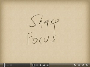
Too many stimuli – too many interruptions – too little focus – too little thought?
For those of us who find neatness and organization an ever present challenge, our screens – whether computer, phone or tablet, may offer no refuge. Littered with icons, busied with backgrounds, riddled with ribbons – the typical Windows landscape.
My inspiration for this essay comes from an iPad / iPhone App called Zen Brush. Written by folks in Japan who live near the center of the 2011 earthquake, it presents a drawing surface elegant in its simplicity and execution. It presents so few controls, yet render strokes with a delightful.
As a tool for a purely visual activity, the wordless experience when drawing with Zen Brush works well. Just two brush shades, brush size, erase and a packaged set of themes are all the tools presented. For $2.99, try it and enjoy.
The iPad experience and the pleasure of Zen Brush inspired me to take a fresh look at Windows techniques that minimize visual clutter, and help focus thought and work on the task at hand. Before trying these, try to sense how you interact with a computer. These suggestions may work better if the name of a program triggers thought more easily than an icon. If you can click on an icon without thinking at all about the name of the program, more visual cues may help. My strategy uses both – starting with names, then using fewer visual cues in their appropriate context. These suggestions assume a Windows 7 environment, without the touch screen enhancements coming in Windows 8.
First Step – Clear the Icons
Clear the icons off your desktop. As an experiment in near zero clutter, trying clearing everything but the Recycle Bin. (It resists removal anyway.) Mousing to an icon, especially when there are many of them, is slow and a demanding hand / eye coordination activity. The visual benefits of icons are reduced when they rearrange or move.
To launch programs, use a combination of the task bar for just a few of the most frequently used programs and Windows Search for less frequently used programs. I prefer Windows search to the Start Menu. It is fast, and it triggers the brain’s association with the name or a program, without having to mouse through a menu.
Second Step – A Peaceful Desktop
Simplify the desktop, using an image or theme with minimal distraction. While it is most tempting to populate the desk with the delicious smile of offspring, that will also reduce focus on work. Enjoy those photos in their appropriate time. For your desktop, choose a photo or artwork with low detail or just a soothing color or gradient.
Third Step – Hide the Ribbons
The ribbon interface – officially in Microsoft Speak the Fluent User Interface – can be hidden. I prefer to toggle it with CTRL F1, but there is also the caret icon in the upper right corner of the ribbon. When needed for a task, the detailed collection of tools presented by a ribbon can be very helpful. When not needed, hiding the clutter of icons lowers stress and distraction .
Fourth Step – Magic Keys
With Windows 7 we have a tool for managing the cluttered pile of too many open windows . The combination of Windows (Start) key (between CTRL and ALT ) plus D toggles the open windows with a clean desktop – instantly. Though the Show Desktop region to the right of the time in the task bar does the same thing, keystrokes remove the need for mouse precision. The Windows key plus TAB cycles open windows in a dramatic visual that also presents an uncluttered and focused way to view and choose a window. Together, showing the desktop, then Windows TAB to a desired window offers a clear clean focused way to navigate.
Let me know whether you find this strategy helpful.
